


Position in css?
- this property helps us to position any element in a web page , with the help of top,left,right and bottom the final position will decide.
- The position property of CSS is used to specify the location/position of the element on the web page. This property helps us to manipulate the location of the element. The top, right, bottom, and left properties determine the final location of positioned elements.
Five types of position properties
- static
- relative
- absolute
- fixed
- sticky
Static
- the static or the default position of the boxes are always same.
syntax:-
position: static;
Relative
- Just like static, in this also element will be positioned according to the normal flow of the page. But, for relative top, right, bottom and left properties will work. When we give some value to any or all of these properties then the position of the element having relative value will change from it's original position as per the values of top, right, bottom, and left. syntax:-
position: relative;
Absolute
- If we apply absolute to any element then it will change its position with respect to its parent, it will calculate right , left , bottom , top from its parent. It removes elements from normal document flow.
syntax:-
position: absolute;
Fixed
- The element is removed from the normal document flow, in the fixed position the element is always fixed at one position , mostly we use this property in the header nav bar , when we want to fix our nav bar at the top. syntax:-
position: fixed;
Sticky
Sticky is little different from fixed property , in sticky position when we move our page then it remains fixed on its position only upto when its parent element is on screen or visible on web page.
note : fixed position elements are fixed on the screen they have nothing to do with their parent element but in case of sticky , elements remains on a fixed position only inside their parent element
syntax:-
position: fixed;
Flex-box
Flexbox is a property of CSS for making a flexible box, but it is the older version. Nowadays. Flex is used in place of flexbox; we can also use inline flex.
Flex is a property of CSS which helps us to make perfect layout of all items in container. By using flex , we can use some properties of flex in CSS to setting up the directions , alignment etc. syntax:-
display : flex ;
Properties of Flex
The properties of flex is based on two terms
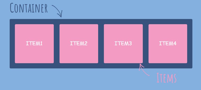
Flex-Container
Flex-Items
Properties for Parent
In this, the properties of Flex are given in the container and all the items will get affected by the property given in Parent. Container is the Parent and items are children
Display
- All the items will cover the block area, so it is required to give property display as flex. so that all the items will start work accordingly. Container can be targeted by class, id or any tag which is performing the role of parent and contains child in it.
syntax:-
.container
{
    display:flex;
}
Before or after display:flex;
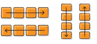
Flex-direction
- Flex-direction is the property which tells the element in which position they need to be get aligned either it's in row or column.
- flex-direction contains four values in it i.e.
row, row-reverse, column, column-reverse. syntax:-
container
{
    display:flex;
    flex-direction: row | row-reverse | column | column-reverse;
}
Flex-wrap
In flex , all the items got aligned in one-line and if we add some items in the flex it also add them in the same by reducing the width of the other items to get the new item adjusted in the same line.But some time we want to add some new items in the new line rather than to add them in the same line For that purpose, we will use the flex property “flex-wrap”.
while talking about responsiveness , when we reduce the screen size the flex-items start shrinking if value is
no-wrapor if the value iswrapthen the items start adjusting to new line while reducing the screen size
flex-wrap contains three values in it i.e. wrap , nowrap, wrap-reverse, By default, it is nowrap.
syntax:-
container
{
display : flex ;
flex-wrap : no wrap | wrap |wrap-reverse;
}
item in green background are given value as NO-WRAP
item in yellow background are given value as WRAP
Justify-content
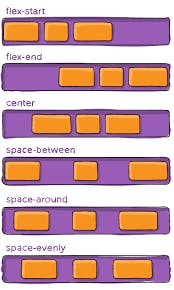
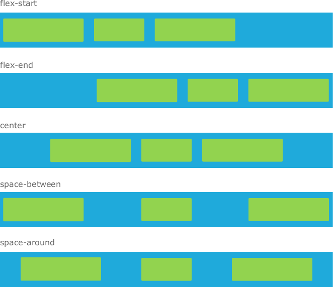
Justify-content is the property of flex which shuffle up the items of container horizontally. There are many value are used in justify-content.
By default, justify-content value is flex-start. It works as a direction “row”, will align the items from the starting of the row.
syntax:-
container
{
    justify-content: flex-start | flex-end | center | left | right | start | end | space-around | space-between | space-evenly;
}
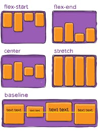
Align-items
align-items is working as property justify-content but the difference is that, align-items will align the items vertically.
Some of the values are also same as in justify-content. syntax:-
container
{
    display:flex;
    align-items: flex-start | flex-end | center | stretch;
}
Align-content
- align-content will align the lines vertically(the whole line of the container), it will work on multiple lines. So,it is necessary to use multiple lines to see the result of align-content.
- To use multiple line, we need to use "flex-wrap : wrap or wrap-reverse" . because "nowrap" will give no effect to result. syntax:-
container
{
    display:flex;
    align-content: flex-start | flex-end | center | stretch | space-around | space-between ;
    flex-wrap: wrap ;   /* wrap-reverse */
}
Properties for Child in CSS
- In this, the properties of Flex are given in the child and that particular the items will get affected by the property given instead of all the items. syntax:-
.container
{
 display:flex
}
item
{
   properties : value;
}
Order
- order property will work on the order of alignment of items. In simple words, we can say that initial order of all the items is 0 and can be increased by infinite value according to the items. By using order property, we can change the order of each item as per our requirements.
- It works as mostly as a graph.
- Suppose we have only 10 items and how we can give order 100 to any item. But it will work as that particular item having order 100 will be shifted at the end. This is how it works.
syntax:-
container
{
  display:flex;
}
item
{
  order: 0 | 1 | 2 |........| infinite; /*negative values are allowed */
}
flex-grow
- Flex-grow will increase the size of particular item by number of times. Initial value of flex-grow is 1.
- If we give flex-grow :2, the size of that item will increase two times of the other item and value goes upto infinite but according to the items present. syntax:-
container
{
  display:flex;
}
item
{
     flex-basis: value; /* as we set in width or height */
    flex-grow:1 | 2| 3 ......| infinite ; /* negative values are invalid*/
}
Flex-shrink
- flex-shrink will decreases the size of items. The initial value of flex-shrink is 1.
- We need to set the width of flex-basis of all the items to see the result of flex-shrink. flex-basis is the property to set the width of the items for flex-grow and flex-shrink. syntax:-
container
{
  display:flex;
}
item
{
    flex-basis: value; /* as we set in width or height */
    flex-shrink:1 | 2| 3 ......| infinite ; /* negative values are invalid*/
}
Align-self
- This property will align the specified items in vertical manner (on cross-axis).It works as align-items but the difference is that it will align the particular item instead of all items.
- It has mainly five values syntax:-
container
{
    display:flex;
}
item
{
    align-content: auto | flex-start | flex-end | center | stretch  ;
}