


Grid in css ?
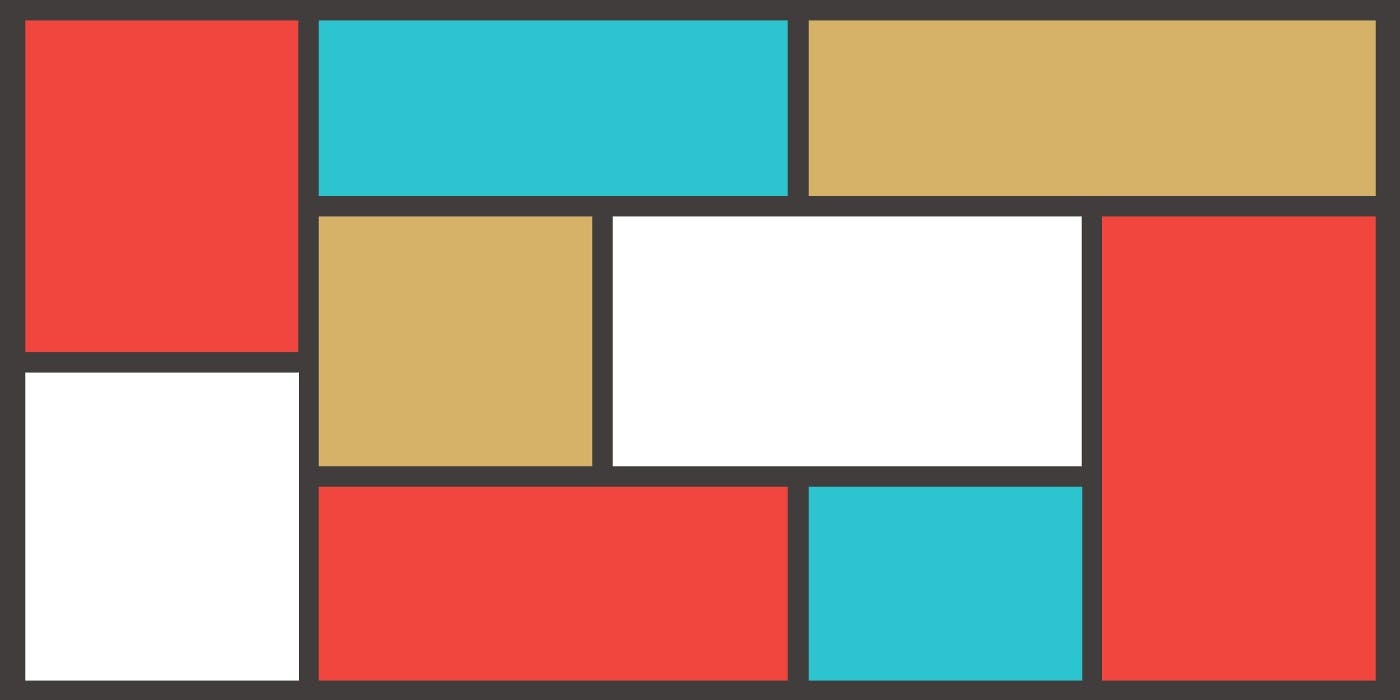
- Grid is used to to arrange the HTML elements in desired layout. We can arrange the elements in the columns and rows as we wanted.
- In CSS flexbox we can only arrange the items in the one dimensional format we don't have much control over the rows and columns it is difficult to align them using the flexbox.
- But using the grid we can easily control the layout and grid provides a lot of functionalities which are difficult to achieve using the flexbox that's what makes CSS Grid most important.
- Similar to the CSS flexbox we have two properties for the parent elements and child elements
As Flex-box have two types of properties i.e. of container and item elements ,Similarly the properties of Grid is categorised into parent and child element properties
Properties for Parent /Grid Container
Display
It is used to define the element as grid container. This property is used to arrange the items in container in inline or block depending on the value and element. It helps in taking the only space where the content is then using other properties we can set the direction and other properties.
- This property is set to grid while using CSS grid layout model without this other properties of the grid won't be working. syntax:-
.container {
    display: grid;
}
Grid-template-columns and Grid-template-rows
- These properties are used to declare the number of grid we want by providing the grid layout width and height by using both column and row templates
- grid-template-rows : using grid template rows we can assign rows to the container, we can also set the height of the column in the grid layout. syntax:-
//Both method's same work
.container{
grid-template-rows : 1fr 1fr 1fr ;
grid-template-rows : repeat(3, 1fr) ;
}
- grid-template-columns: using grid template columns we can assign columns to the container, we can also set the width of each column in the grid layout. syntax:-
.container{
// both syntax same task
grid-template-columns : 1fr 1fr 1fr ;
grid-template-columns : repeat(3, 1fr) ;
}
- Grid-template:It is a shorthand property for the grid-template-rows, grid-template-columns and grid-areas properties. syntax:
.grid-container {
  width: 500px;
  display: grid;
  grid-template: 50px 50px / 50px 50px 50px 50px; /*auto can also be given*/
Grid template area
It is used position our elements in a web page. We can easily set the layout of our webpage by using this property. We need to keep in mind some points before using the grid template area property. We need to give grid-area property to child elements and assign a name to that which we can use in grid-template-area.
We need to have every cell of the grid filled. To span across 2 or more , repeat the names accordingly. If you wish to leave a cell empty, use a . (period). Areas must be rectangular — for example, we can't have an L-shaped area. We cannot repeat the areas at different location. Syntax :
.container{
        grid-template-areas:
          "item1 item2 item2"
          "item3 item2 item2"
}
Gap
- As the name suggest it is used to provide gap between rows and columns, by default the gap value of row and column is 0, we assign the gap property in our parent container. Syntax :
.container{
gap:row_gap column_gap
eg.
gap:10px 20px;
}
It will give gap 10px gap in row and 20px gap in column. If we use single value in gap then that will be applied in both rows and columns.
- There are two more gap properties.
- Row Gap
- As the name suggest it will apply gap between rows. Syntax :
.container{
grid-row-gap:10px;
}
Column Gap
As the name suggest it will apply gap between columns. Syntax :
.container{
grid-column-gap:10px;
}
- grid-gap :
- It is a shorthand property for the row-gap and the column-gap properties. example:
grid-gap : 50px 100px;, here50pxis the gap between the rows and100pxis the gap between the columnsJustify Content and Align-Content
Justify Content It is used to align the items in Inline/Row axis(Horizontally). Align Content It is used to align the items in Block/Column axis(Vertically). We can set the items in middle of our web page by setting align-content and justify-content values as center. We also have different values for align-content and justify-content.
Properties for Child Elements
Grid Area
- We use grid area in the child element. We can use this by using grid-template-areas in parent container. We define names of items in container by using grid-area. Syntax :
.item1{
        grid-area: nav;
      }
Grid Column
- We use grid-column to define the start and end index for the child element. syntax:
.item1{
grid-column:start_index/end_index;
}
We also have 2 other properties for setting up the start and end index
- Grid Column Start We can define the starting index or column number by using this. Syntax :
.item1{ grid-column-start:2; }
- Grid Column End We can define the ending index or column number by using this. Syntax
.item1{
grid-column-end:4;
 }
Grid Row
- We use grid-row to define the start and end index for the child element, means it increases the height of element Syntax :
.item1{
grid-row:start_index/end_index;
}
We also have 2 other properties for setting up the start and end index
Grid row Start
- We can define the starting index or row number by using this. it decides from where the height will start Syntax :
.item1{ grid-row-start:2; }
Grid row End
- We can define the ending index or row number by using this. it decides where the height will end. Syntax
.item1{ grid-row-end:4; }